Visualization module
The visualization module allows both interactive visualization using bokeh, as well as generating static image files. Below a screenshot of the interactive interface is included:
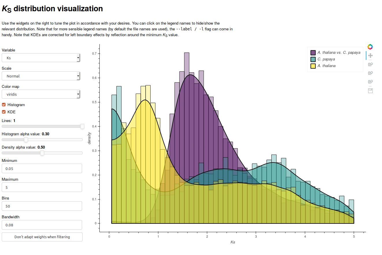
The interactive interface allows modification of key parameters, such as the histogram bin-width and KDE bandwidth. You are strongly encouraged to observe the effects of modifications in these parameters, as they may reveal visualization artifacts. As one can see from the screenshot, it allows overlaying multiple distributions, overlaying histograms and KDEs, and dynamically hiding and showing of distributions (by clicking the entries in the legend). Note that to run the interactive visualization, a bokeh server should be running, which you can initiate with the following command:
bokeh serve &
Note that bokeh should be installed automatically when installing wgd.
Alternatively, the viz module also allows generating static images when the
--interactive flag is not set.
A note on histogram visualization
KS distributions can be visualized in three main ways, (1) a pairwise KS value histogram, (2) a node-averaged histogram and (3) a node-weighted histogram.
In the first case all pairwise estimates are added with equal weight to the
distribution, however, more ancient duplications will therefore end up in the
KS distribution with multiple estimates. Such a representation is thus rather
flawed, as it will artifically amplify peaks in high KS regions because there
are simply more estimates for older duplication events. This representation is
not used in wgd, however it can be simply generated by simply plotting the
KS column of the tsv output from wgd ksd in R or Python.
Node-averaging addresses this problem by averaging KS estimates for a particular duplication node in a gene family tree. This is the default distribution used for modeling purposes such as mixture modeling and KDEs.
Node-weighted KS values use the same principle as node averaging, but keep the
original values. Instead of plotting a histogram of averages for all nodes, a
histogram is plotted where every KS estimate for a particular duplication node
is added with equal weight such that the weights of all estimates for that node
sum up to one. Since this is arguably the representation closest to the actual
data, this is the default output when running wgd ksd. They can also be
plotted using the --weighted flag in wgd viz.
Another subtle point is whether the weights or averages are computed before or
after filtering steps are applied. By default wgd employs a strategy where
weights or averages are computed after filtering, effectively designating the
filtered values as outliers. The wgd viz tool gives the option to look at the
effect of calculating averages before filtering.
Reference
Copyright (C) 2018 Arthur Zwaenepoel
This program is free software: you can redistribute it and/or modify it under the terms of the GNU General Public License as published by the Free Software Foundation, either version 3 of the License, or (at your option) any later version.
This program is distributed in the hope that it will be useful, but WITHOUT ANY WARRANTY; without even the implied warranty of MERCHANTABILITY or FITNESS FOR A PARTICULAR PURPOSE. See the GNU General Public License for more details.
You should have received a copy of the GNU General Public License along with this program. If not, see <http://www.gnu.org/licenses/>.
Contact: arzwa@psb.vib-ugent.be
The viz module collects several common visualization functions for wgd
as well as the interactive boke application for plotting multiple Ks
distributions with kernel density estimates interactively.
-
wgd.viz.histogram_bokeh(ks_distributions, labels)¶ Run an interactive bokeh application. This requires a running bokeh server! Use
bokeh serve &to start a bokeh server in the background.Parameters: - ks_distributions – a list of Ks distributions (pandas data frames)
- labels – a list of labels for the corresponding distributions
Returns: bokeh app
-
wgd.viz.plot_dists(dists, var, scale, ax, alphas, colors, labels, bins=40, weighted=True, **kwargs)¶ Plot a bunch of histograms stacked on each other.
Parameters: - dists – ks Distributions
- var – the variable of interest
- scale – log scale?
- ax – figure axis
- alphas – alpha values (opacity)
- colors – color values
- labels – labels
- bins – bin number
- weighted – plot a node-weighted histogram (node-averaged otherwise)
- kwargs – other args for plt.hist
Returns: ax
-
wgd.viz.plot_selection(dists, output_file=None, alphas=None, colors=None, labels=None, ks_range=(0.05, 5), filters=(0, 300, 0), bins=50, title='', weighted=True, **kwargs)¶ Make a figure of histograms for multiple distributions and variables
Parameters: - dists – Ks distributions
- output_file – output file name
- alphas – alpha values (opacity)
- colors – colors
- labels – labels
- ks_range – Ks range
- filters – alignment stats filters
- bins – number of bins
- title – plot title
- weighted – plot a node-weighted histogram (node-averaged otherwise)
- kwargs – other arguments for plt.hist
Returns: figure
-
wgd.viz.syntenic_dotplot(df, min_length=250, output_file=None)¶ Syntenic dotplot function
Parameters: - df – multiplicons pandas data frame
- min_length – minimum length of a genomic element
- output_file – output file name
Returns: figure
-
wgd.viz.syntenic_dotplot_ks_colored(df, an, ks, min_length=50, color_map='Spectral', min_ks=0.05, max_ks=5, output_file=None)¶ Syntenic dotplot with segment colored by mean Ks value
Parameters: - df – multiplicons pandas data frame
- an – anchorpoints pandas data frame
- ks – Ks distribution data frame
- min_length – minimum length of a genomic element
- color_map – color map string
- min_ks – minimum median Ks value
- max_ks – maximum median Ks value
- output_file – output file name
Returns: figure